BUILD HIGH-PERFORMING SITES
Website builder
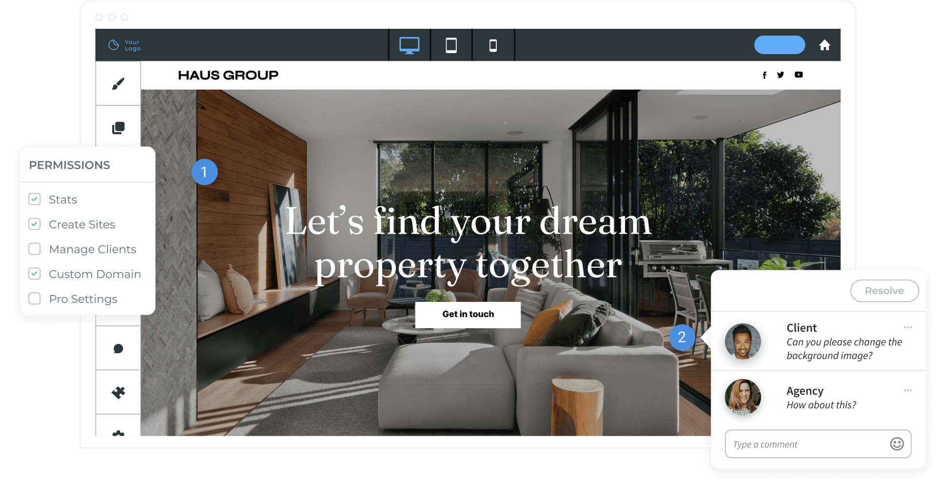
Create beautiful websites at scale
ALL ESSENTIALS INCLUDED
AI Assistant
Boost your efficiency with built-in AI
tools
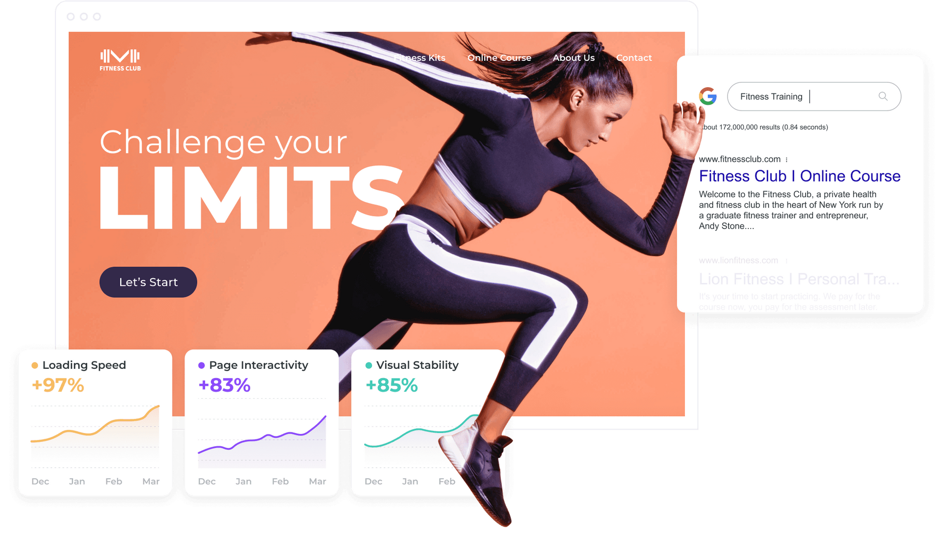
SEO
Build sites that rank higher
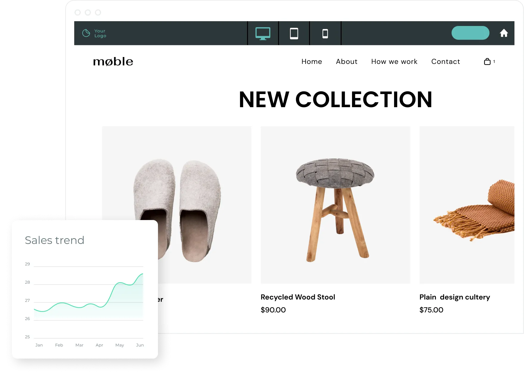
eCommerce
Sell products online and offline
Transactional sites
Sell services, subscriptions, and more


